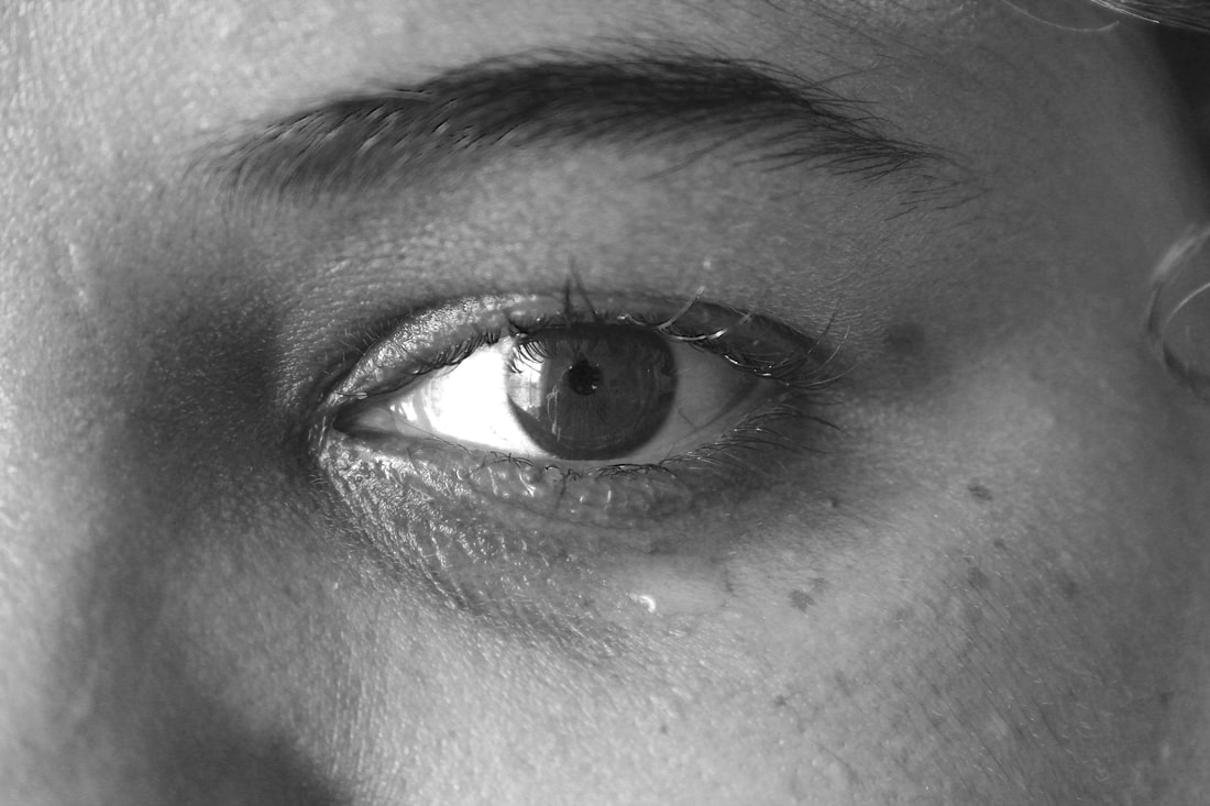
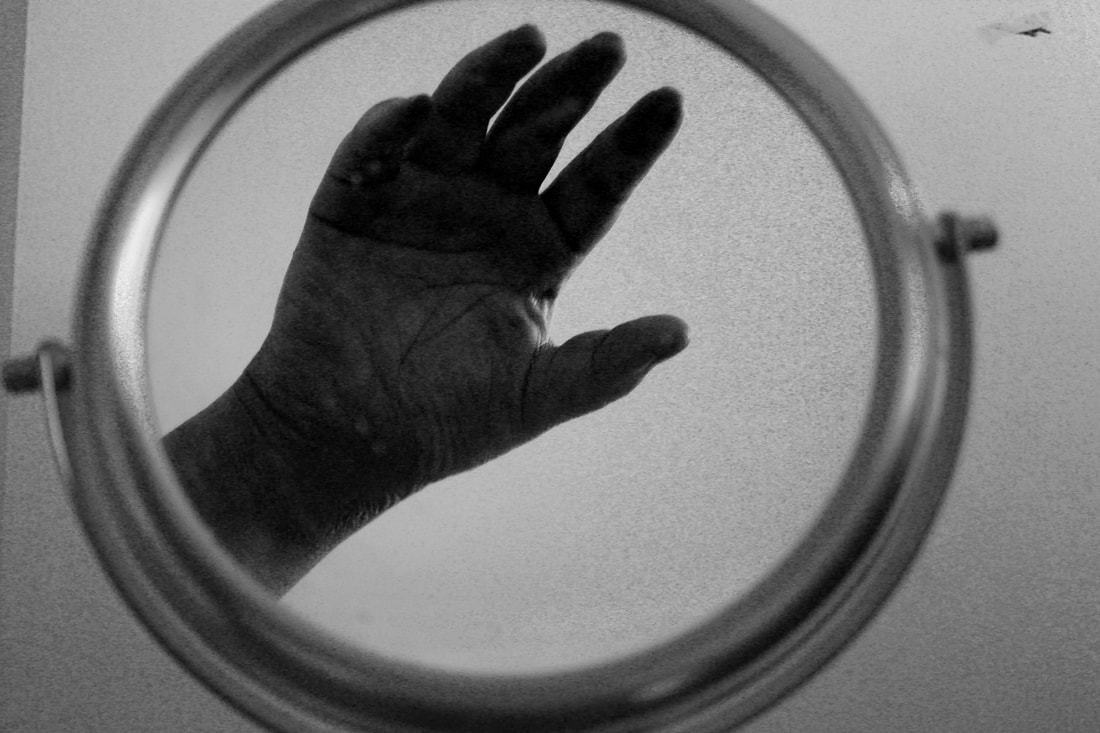
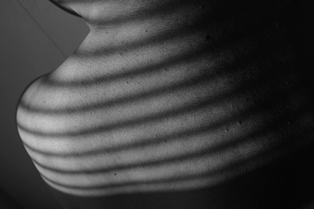
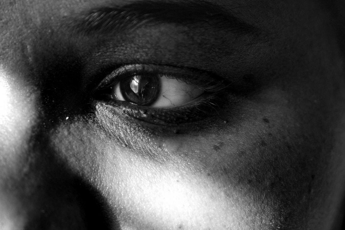
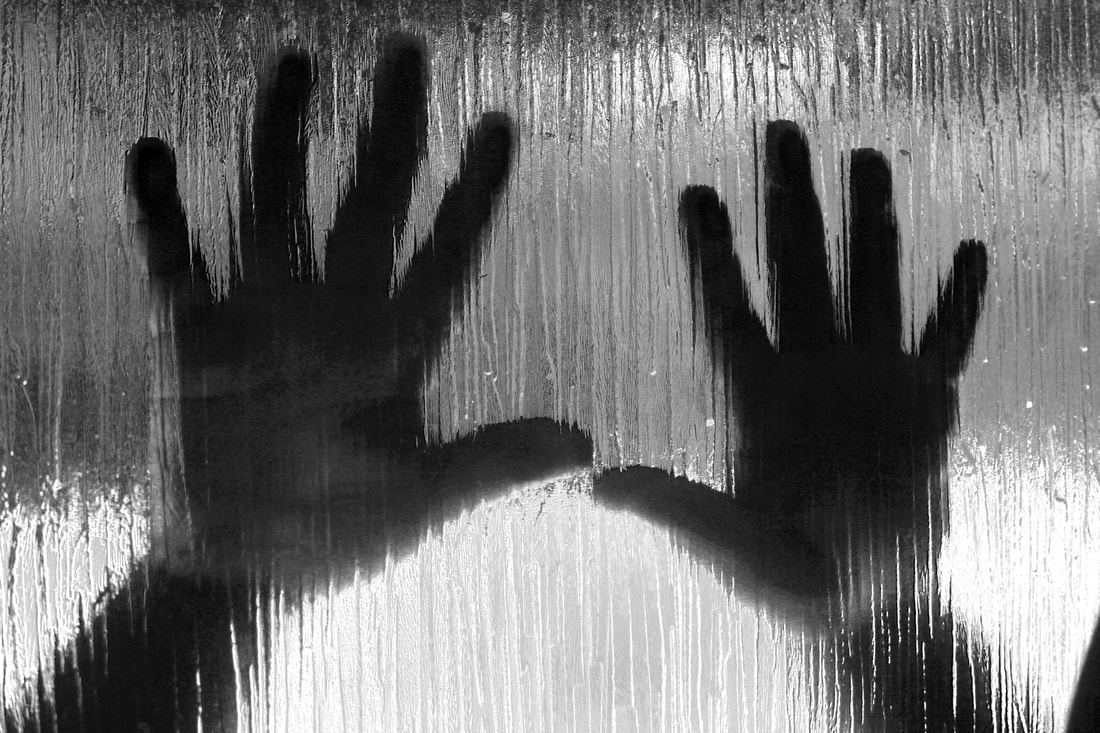
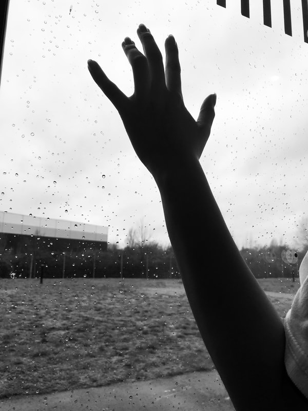
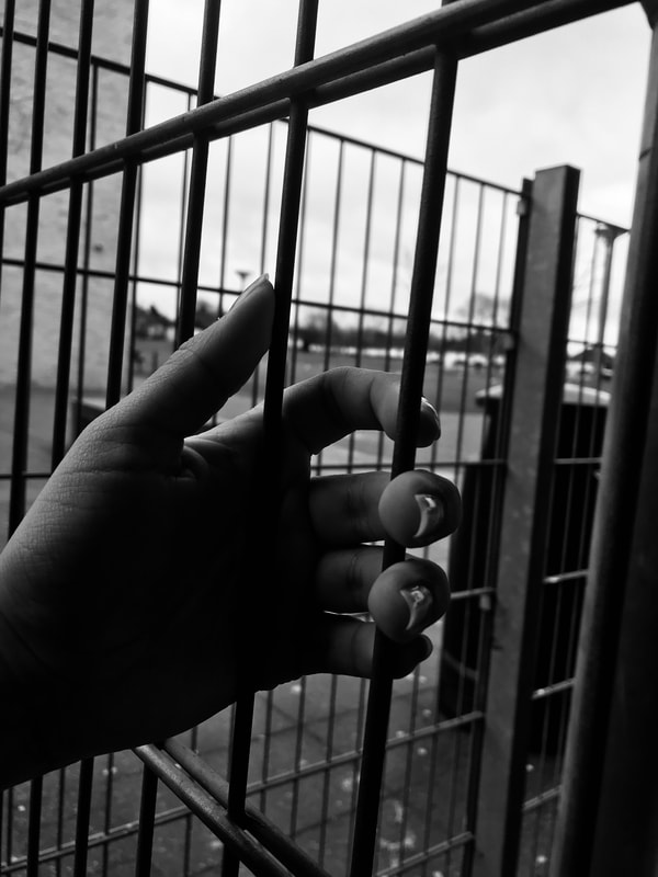
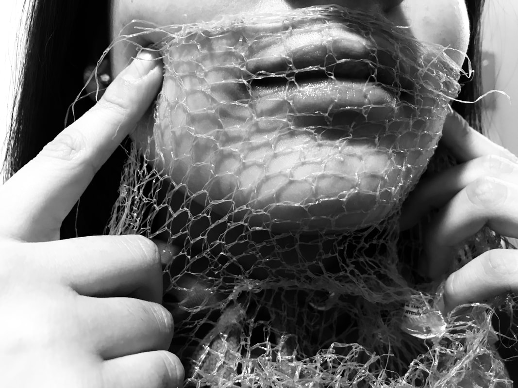
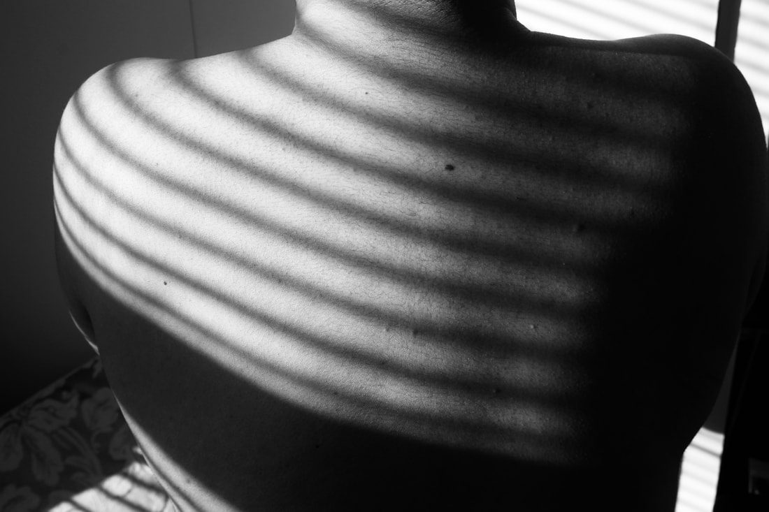
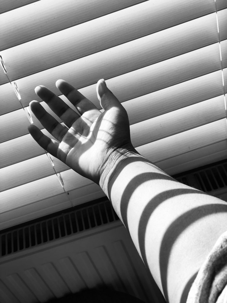
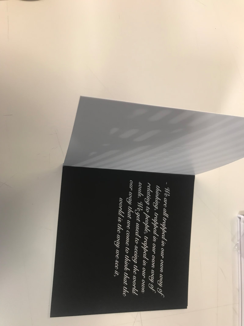
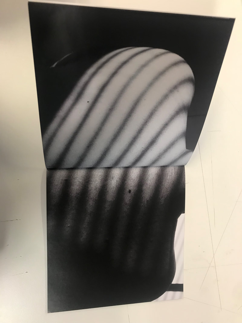
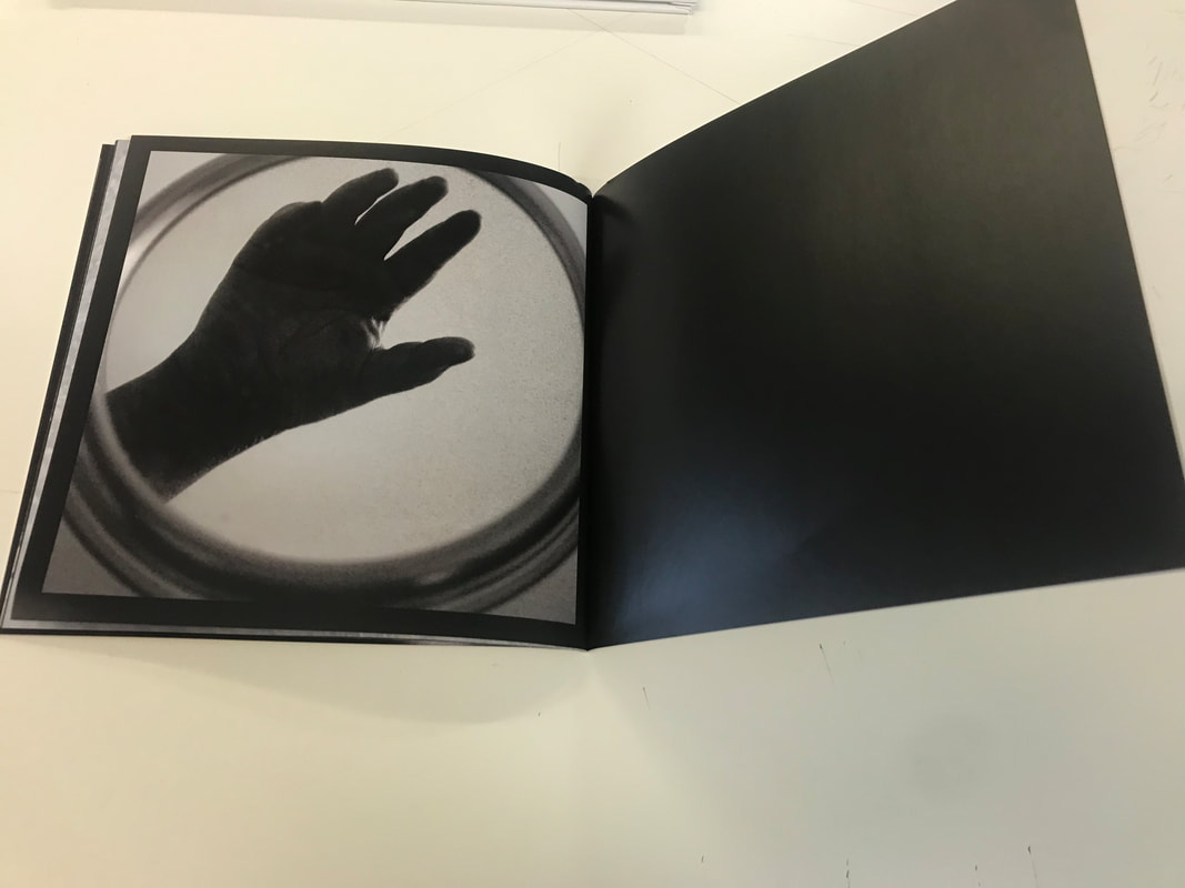
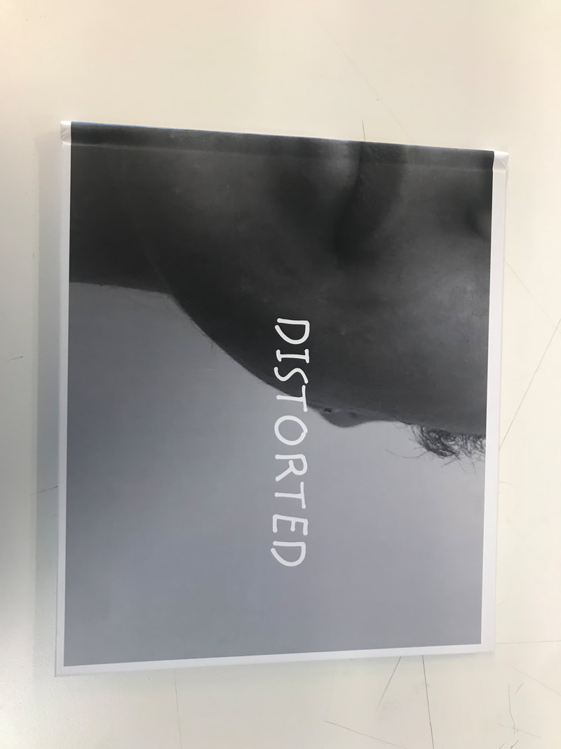
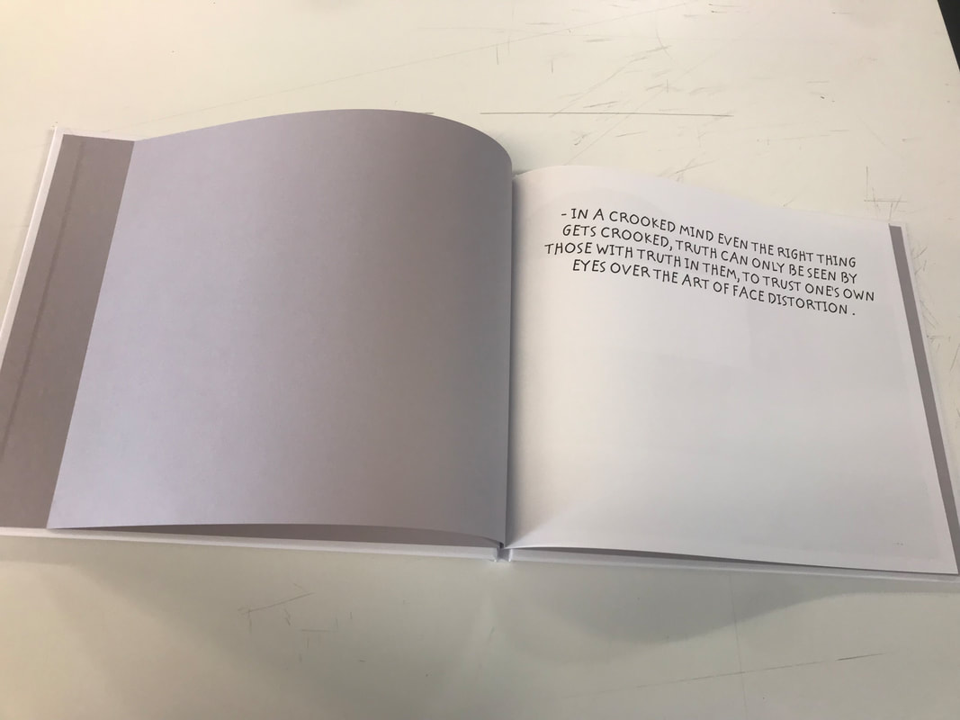
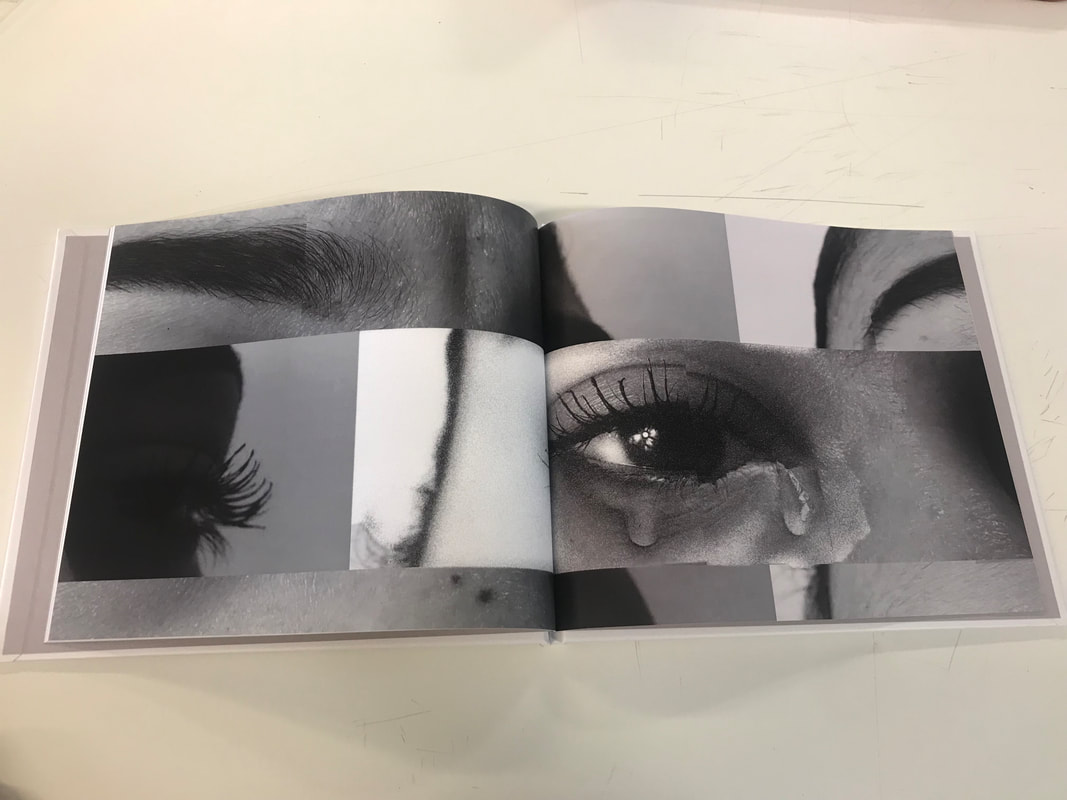
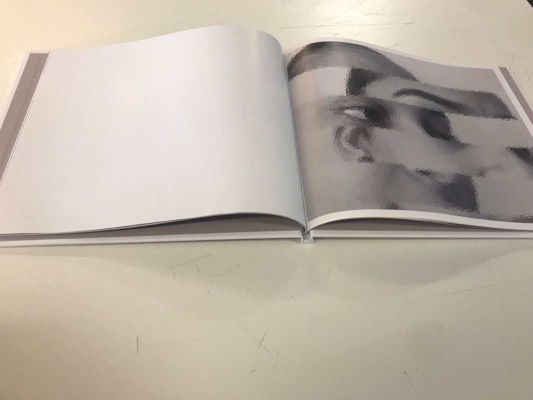
For this photobook I intend on creating two photobooks based off of the theme "Trapped" and the second photo book will be named "distortion".With these photobooks I will be trying to tell a story, therefore the first photobook being part and the second phonebook being part1. The first phonebook will feature images of body parts such as they eye, hands, shoulders this shall represent how everything is in perfect condition. I will try to create various patterns in the images such as lines, diamonds etc. Whereas the second phonebook will include portrait photos of just the face but will be edited using photoshop to create a distorted effect on the face. The distorted lines will represent the second part of the story where the face has now been altered . The similarity between these photobooks is that they will both include the repeated pattern of lines one artificially created and the other one including natural lines (shadows) using the sunlight furthermore I would like the continuous repetition of lines in my photos to depict as if they're bars from a cell to conclude this also helps to emphasie the theme of trapped. In addition the photos will be black and white images which in my opinion have negative and positive connotations as the colour black symbolises fear and mystery whereas the colour white symobilises purity and light. The contrast between these colours helps to show that they're may be hope for the person behind these images.
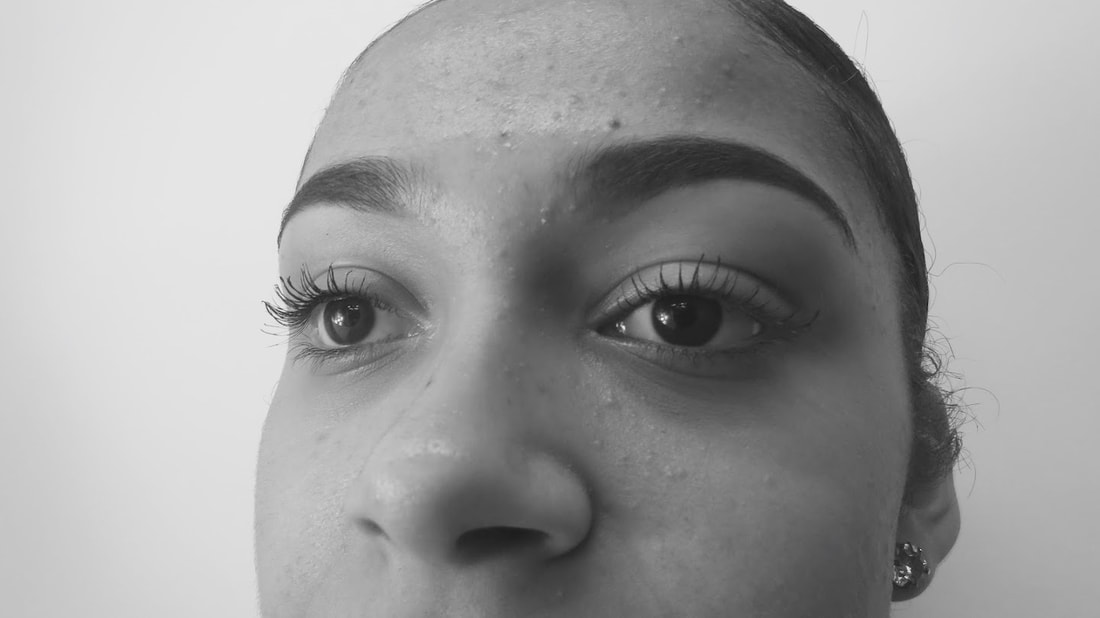
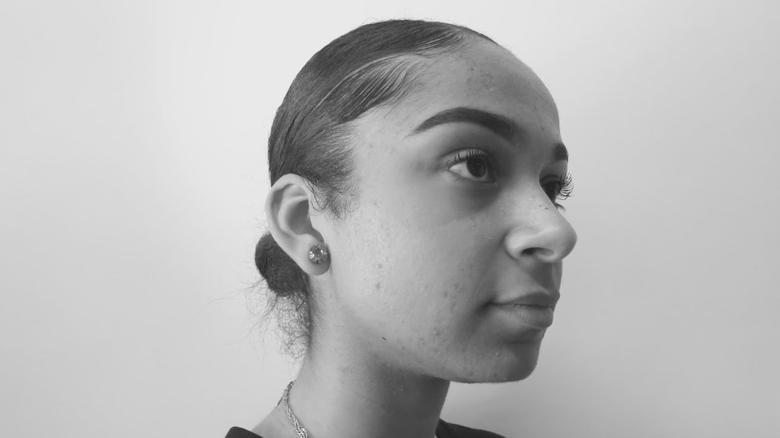
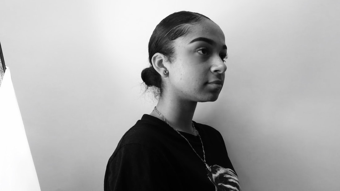
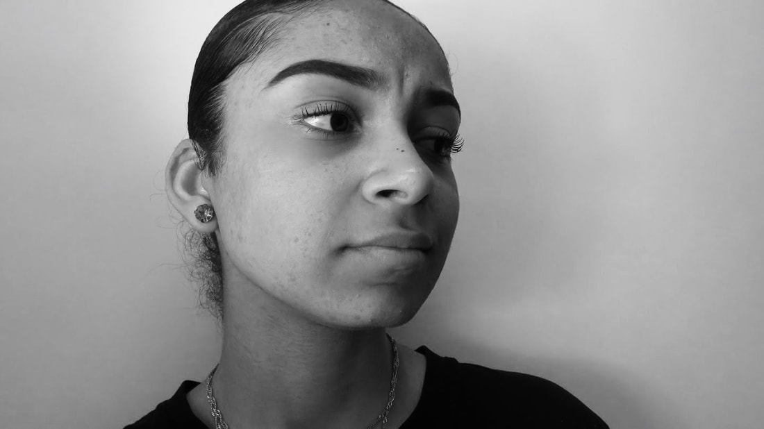
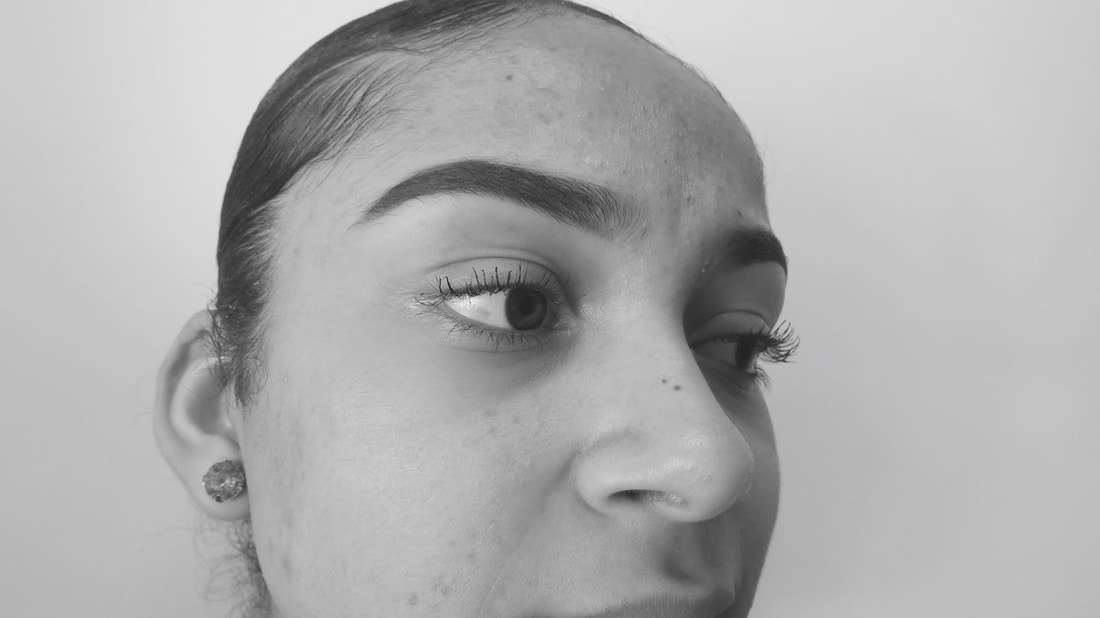
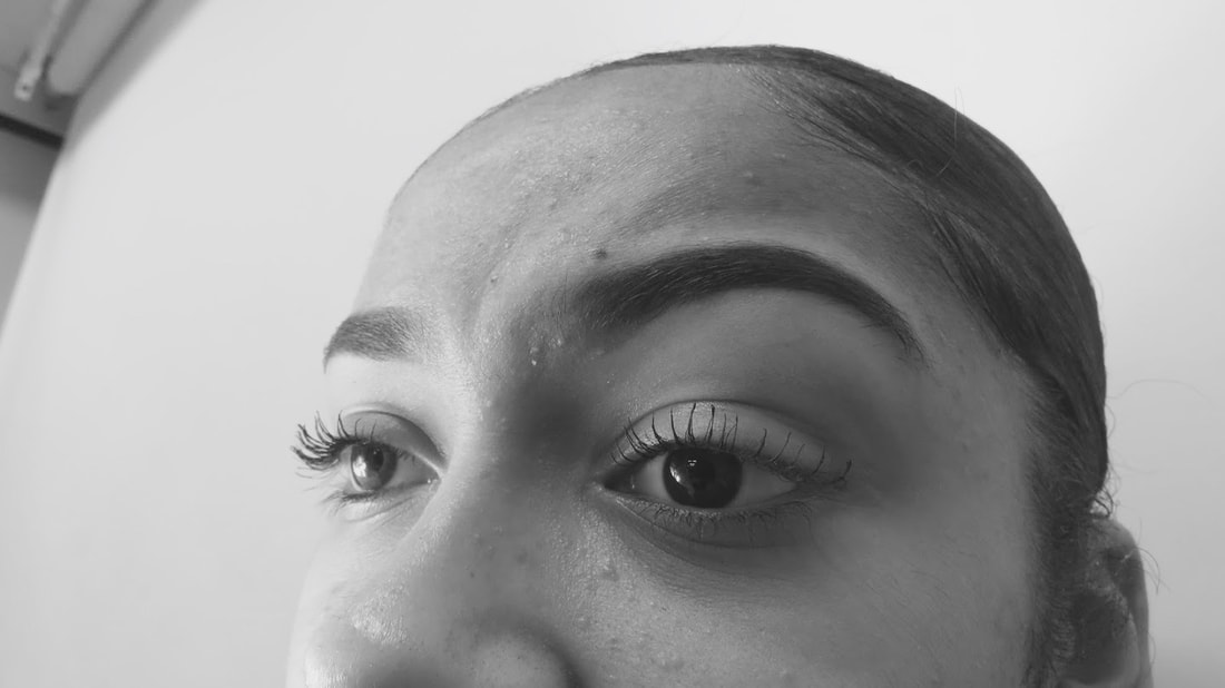
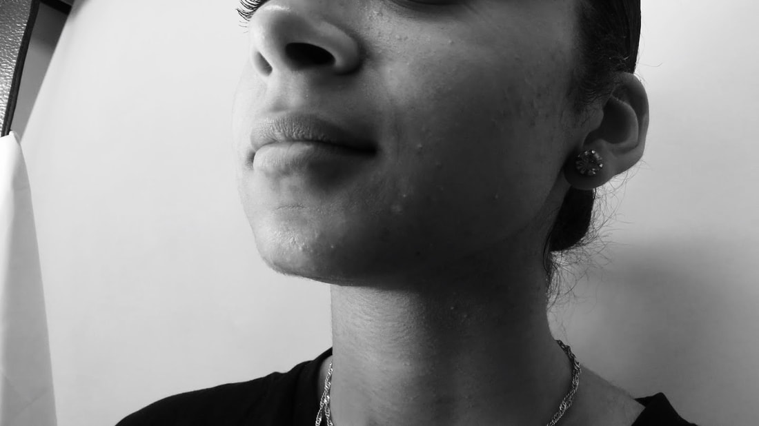
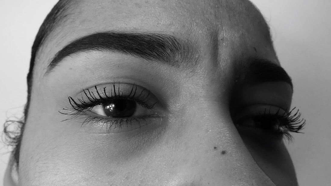
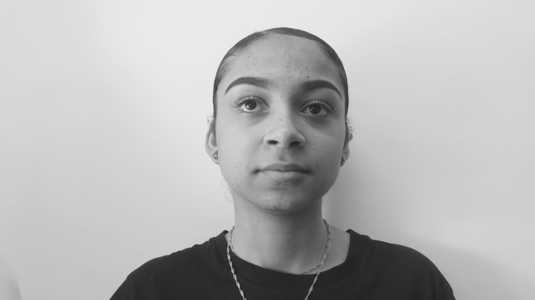
FIRST SHOOT FOR "TRAPPED" PHOTOBOOK
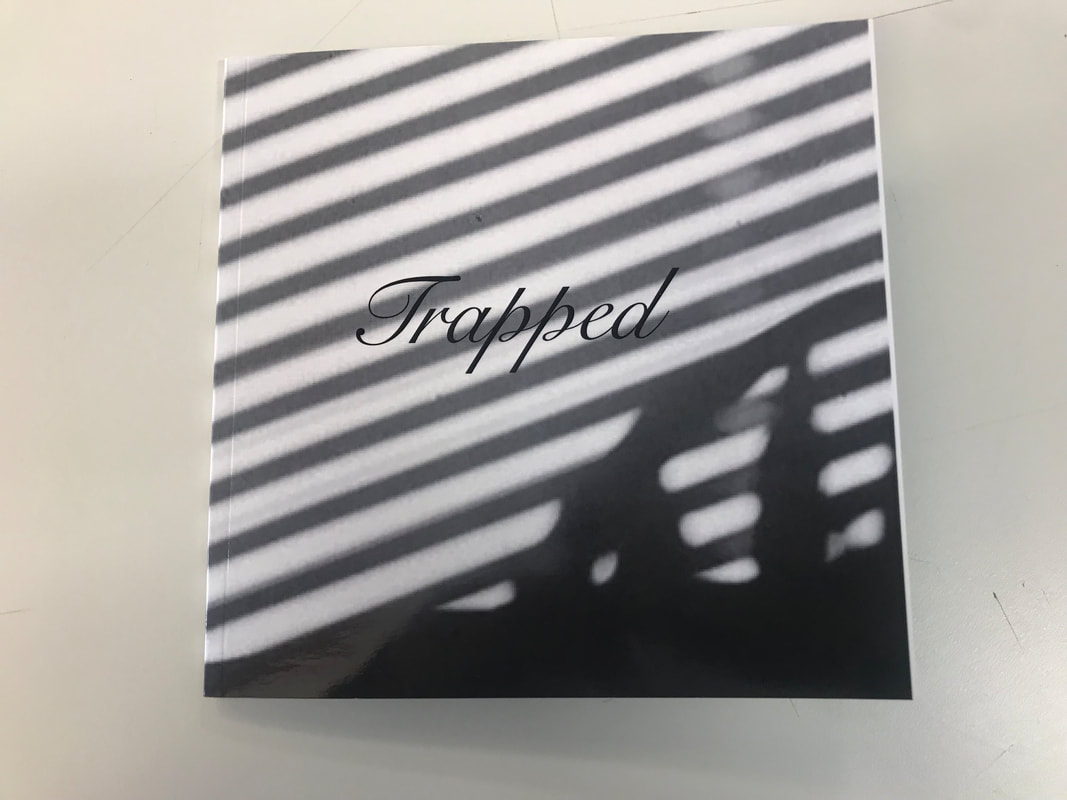
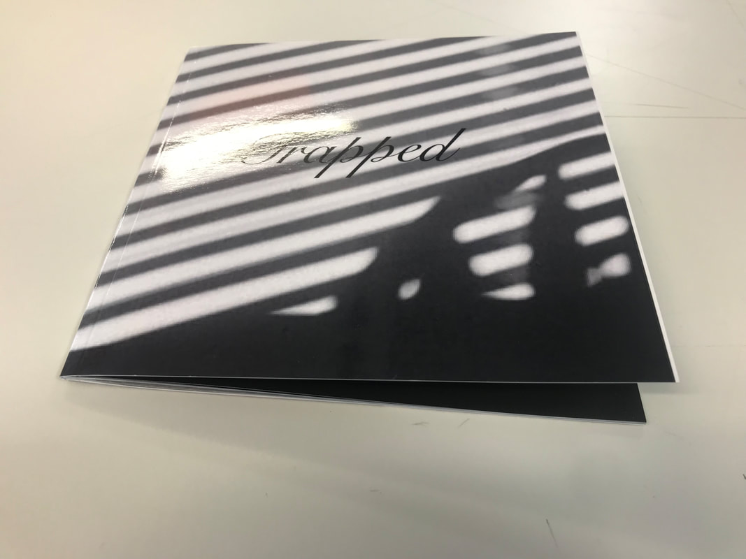
PHOTOBOOK DUMMY
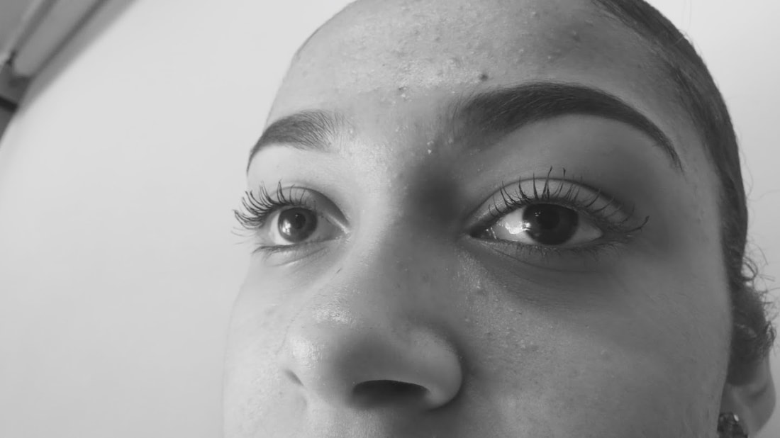
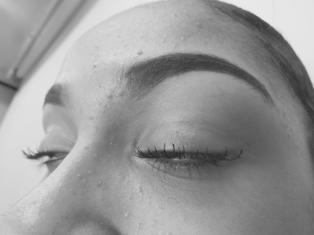
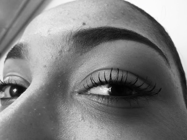
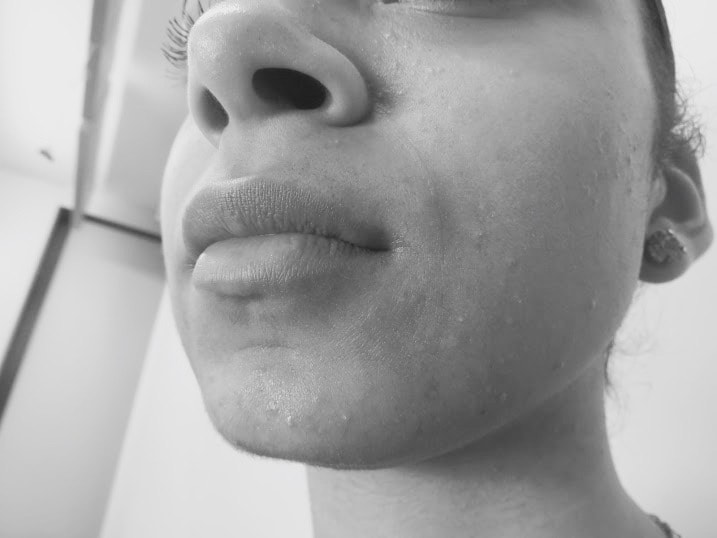
SHOOT FOR "DISTORTION" PHOTOBOOK
EDITING PROCESS
FINAL OUTCOME OF PHOTOBOOKS
- "TRAPPED"
This book concluded a total of 20 pages in the shape of a small square ("7 x7") ("18cm x 18cm") finished with a soft cover.
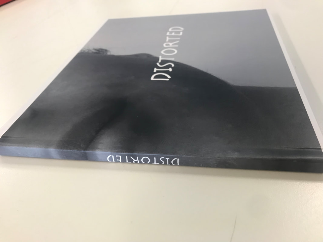
"DISTORTED"
This book also included of 20 pages in the size of a standard landscape (10×8 in, 25×20 cm) this was finished with a hardback matte cover .
Evaluation
Overall the outcome of these photobooks was successful I achieved the expectation I wanted as I feel like I conveyed the message that was supposed to be given when viewing this book. The theme of black and white helped achieve the themes of both books.What I think I have done particularly well is the sequence and layout of these images as they both manage to tell a story without words although there's an introduction to both books in the beginning. Some images that feature in these books in comparison to the other photos overpower each other, these were the images I decided to put on the double page. However in the process of creating this book on the blurb site some images have a white border whereas the other images fit perfectly in the frame. Throughout books there is a distinction between some photos predominately the cover of the second photobook (distortion) and the images inside.However the quality of the images in both books vary between using a digital camera and my iPhone camera although its not very noticeable some images did come out blurry since in the process of making the photobook on blurb its necessary that some photos had to be zoomed in to fit the frame. In other words the cover photos for the books were chose and captured briskly because both books have different page orientation .This is something that I would've liked to improve in the future and put more consideration into the outside of the book instead of the inside, In my opinion the cover of the photobook is just as important as the inside as this gives a viewer a first impression to what the book contains inside.The research beforehand helped especially develop ideas for my second photobook as it allowed me to experiment in Photoshop with tools I've never used before. In the end the outcome of the photos reached my expectation. Whereas the first photobook didn't allow me to experiment as it contains raw photos but still managed to reach my expectations .
